On thin and fat clients
Like chicks (and blokes too for that matter) it seems even the thin ones are now fat.
Moving all your apps to a browser is all well and good, but they seem to be getting bigger and slower - and no matter how 'nice' they might be in relation to other 'web apps', they just don't stack up against 'thick clients'.
Case in point: google mail.
It actually makes a pretty shitty mail client, and it only gets worse once you're on a few mailing lists with multiple conversations going on. It's quite difficult - and rather slow - navigating conversations and everything needs a click-and-wait. Not to mention the single 'modal' message editor. And is it just me or has it become a lot slower lately? Maybe it's because i'm using a different machine with higher resolution, but it's taking about a second to do things like delete one message. It took 3 seconds to open the inbox after I was looking at 'all messages'. I've only got 7K messages in total, hardly enough to blink at.
I used to be able to easily read a few hundred mails a day with evolution, and there's no way I could get even close to that using gmail; and still get anything else done. So one tends to skim the subjects a lot more rather than scanning the message - and you can often miss important things doing this.
So now I have firefox using more memory than evolution did, handling a tiny fraction of the mail in a less usable manner, more slowly, and using more cpu time, much more network bandwidth, and more power. That's progress?
Scribd
I noticed that 'scribd' has moved from it's awful flash app (which meant I never bothered to follow scribd links) to an awful HTML app (which means I will continue not to follow scribd links). Try overriding your fonts and loading a page - weird things happen that make it completely unreadable. Absolute winner for something designed to share documents, wouldn't you think?
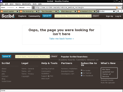
Well that's if it'll even let you read anything - I get the following on one of my computers when I go to the front page (or click on the big link it gives me on this page).
Even if it worked it is such a horrid thing anyway - I have a perfectly serviceable (if a little flawed) PDF viewer on my computer, why not just give me a link to a PDF? If you want to share documents, just put a PDF somewhere people can see it, you don't need these horrid online viewers.
Or just use plain HTML without all those shitful scrolling boxes and other useless clingons which make it harder to use.
Hmm, i got suckered into using facebook again - since none of my 'friends' ever mail me any more there doesn't seem to be any other way to stay in touch or talk to them. Which sucks. The shallowness and emptiness of it all rubs me up the wrong way, like Twatter(tm) every utterance needs to be made in tiny truncated sentence form. Also I'm not really sure I want to know what teenage nieces and nephews are up to in the sort of detail they tend to put online. And I find it deeply disturbing that visiting totally unrelated websites now have dynamic 'facebook social' crap coming up if you were ever logged into facebook with 'keep me logged in'. It doesn't seem to be something you can 'log out' of.
And although I know google tracks everything you do to the same extent, knowing that, and being shown blatantly that a visit to a news story is being linked back to your account - is another matter entirely.

