
Yep, I was bored.
I made a Workbench2.0 window theme for xfce tonight.

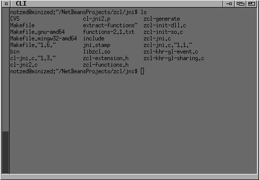
Focused
(yes i realise the depth and zoom buttons are swapped but i'm not re-taking these shots. Oh blast, the bottom-left pixel should be black too.).
Actually why I did this came about in a rather round-a-bout way.
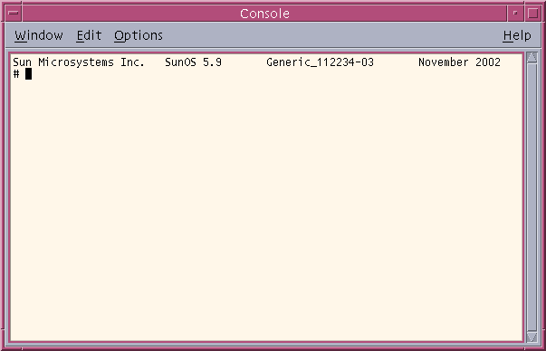
I had to spend all day in Microsoft Windows today debugging some code and as white backgrounds strain my eyes too much I spent some time trying to customise netbeans and the system itself such that it was usable. Netbeans was a copy of the config on another machine plus a theme change and installation of the dejavu fonts. But after a bit of poking around with the 'classic windows' theme I found I could change more than I expected and set it up somewhat amiga-like, as far as that goes (wider borders, flat colours, etc). The theme editor is a pretty dreadful bit of work-experience-kid effort like most of the config windows in that shitstain of an OS shell.
So that got me thinking - it always bothered me that ALL the usable XFCE4 themes have "microsoft windows 95 blue" borders, so i poked around and found the theme I was using (Microcurve) and started randomly editing the XPMs until I ended up with this.
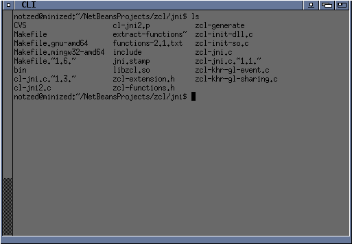
Unfocused
The zoom button is maximise, but the since the depth button doesn't function that way I mapped that to minimise - which will probably take a while to get used to since its no longer familiar and doesn't exactly match it's function. I had to create a new pin button which is definite programmer-art but fits the simple flat design well enough. I already had the close button in the correct spot but decided to drop the menu and shade buttons since I never use them anyway.
Pinned
I did try to have the close and depth buttons right to the edge as they should be but they get cut-off when the window is maximised, messed up if not all buttons are included in the decoration, and it meant I couldn't animate depressing them properly. So I extended the side borders to the top. I made the bottom thicker too - I cant fucking stand trying to hit a stupid 1-pixel high button to resize the windows anyway (particularly when the mouse normally lags as focus changes turning it into a detestable mini-game every time) and it adds a pleasant weight to the windows. The bottom corners are wider as well which also affects the resize handles in a positive way.
Yeah it's still blue ... but at least it's a different blue, of an older and more refined heritage.
PS gimp 2.8 is a fucking pain in the arse to use.
Update: I decided to publish what I have on a Workbench2.0 theme home page. This contains updated screenshots.
Update: Looks like CDE?
Yeah, no.